If you’ve ever worked in graphic design, branding, or printing, you may have heard of PMS colors. But what exactly is a PMS color, and why is it so important?
PMS (Pantone Matching System) colors are a standardized color system used globally to ensure accurate color reproduction in printing, branding, and manufacturing. Whether you’re designing a logo, business card, or product packaging, using PMS colors guarantees that the color remains consistent across all materials and print runs.
In this guide, you’ll learn:
- What PMS colors are and how they work
Why PMS colors matter in branding & printing
Difference between PMS, RGB, and CMYK
How to find & use PMS colors for your design
Where to buy official Pantone color guides
Let’s explore everything you need to know about PMS colors and why they are essential in design and printing!
What is a PMS Color?
A PMS color refers to a shade from the Pantone Matching System (PMS)—a globally recognized color standard developed by Pantone Inc..
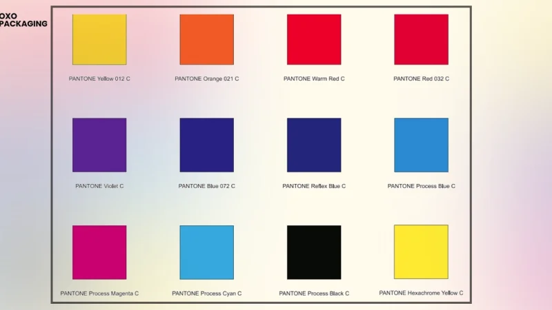
- Each PMS color has a unique code (e.g., Pantone 186 C).
These colors are pre-mixed inks, ensuring color consistency across different materials.
Used in graphic design, fashion, interior design, packaging, and corporate branding.
Example: Coca-Cola’s signature red is Pantone 484 C—ensuring every Coca-Cola product worldwide has the same exact red shade.
Why Are PMS Colors Important?
Using PMS colors offers many benefits in printing and branding.
Ensures Color Consistency
- The same PMS color code will produce identical shades worldwide.
No variation in logos, branding materials, or printed merchandise.
Example: McDonald’s golden yellow is Pantone 123 C—it always looks the same on packaging, signs, and uniforms.
More Accurate Than CMYK
- PMS colors are pre-mixed inks, while CMYK (Cyan, Magenta, Yellow, Black) mixes colors during printing.
CMYK printing may cause slight color variations, while PMS colors remain exact.
Best for: Logos, corporate branding, and product packaging that require precise color matching.
Saves Time & Cost in Printing
- PMS colors eliminate color matching errors, reducing printing mistakes.
Ideal for large-scale branding—ensuring uniform brand identity.
Used by: Global brands like Starbucks, Nike, Pepsi, and FedEx.
PMS vs. CMYK vs. RGB: What’s the Difference?
Understanding color models helps designers choose the right one for different projects.
| Color Model | Best For | How It Works | Example |
| PMS (Pantone Matching System) | Branding, logos, packaging, corporate materials | Uses pre-mixed inks for precise color matching | Pantone 186 C (Red) |
| CMYK (Cyan, Magenta, Yellow, Black) | Printed materials (brochures, flyers, magazines) | Mixes four colors during printing | Not 100% consistent |
| RGB (Red, Green, Blue) | Digital screens (websites, social media, presentations) | Uses light-based color mixing | HEX #FF0000 (Red) |
Tip: Use PMS colors for print, RGB for digital, and CMYK for regular printing projects.
How to Find & Use PMS Colors in Your Design
If you’re working on branding or print design, you’ll need to find the right PMS color for your project.
Step 1: Identify Your Color Needs
- Are you designing for print, packaging, or branding?
If you need consistent colors, PMS is the best choice.
Step 2: Use a Pantone Color Guide
- Pantone provides official color swatch books (like the Pantone Formula Guide).
You can compare actual printed colors instead of relying on screens.
Step 3: Convert CMYK or RGB to PMS
- If you have a CMYK or RGB color, you can convert it to a PMS color using Pantone’s online tool.
- Use Pantone’s Color Finder
Example:
- RGB Color: (255, 0, 0)
- PMS Equivalent: Pantone 186 C (Red)
Step 4: Use PMS Colors in Software
- Adobe Photoshop, Illustrator, and InDesign allow you to use PMS colors directly.
Simply select a Pantone color library in your software and apply it to your design.
Tip: Always check a printed Pantone guide—screen colors may not be 100% accurate.
Where to Buy Official Pantone Color Books
For accurate color matching, designers, printers, and brands use Pantone swatch books.
- Pantone Official Website – Pantone Color Guides
Amazon & eBay – Search for Pantone Formula Guides.
Local Print Shops – Many printing companies sell Pantone color charts.
Tip: Always buy the latest Pantone guide to stay updated with new colors!
Conclusion
PMS colors ensure accuracy, consistency, and professionalism in branding, printing, and design. Whether you’re creating a logo, packaging, or business materials, using Pantone colors guarantees your brand’s colors look the same everywhere.
Key Takeaways:
- PMS colors = Pre-mixed inks for consistent printing.
Pantone is more accurate than CMYK (great for branding & logos).
Use RGB for digital & PMS for print to maintain color consistency.
Convert CMYK to PMS using online tools or Pantone guides.
Buy a Pantone color guide for precise color matching.
Need perfect color accuracy for your brand? Use PMS colors for the best results!
FAQs
1. What does PMS stand for in color?
PMS stands for Pantone Matching System, a standardized color system for accurate printing.
2. Why use PMS instead of CMYK?
PMS colors ensure consistency, while CMYK can vary in print due to ink mixing.
3. How do I convert CMYK to PMS?
Use the Pantone Color Finder tool or check a Pantone swatch book.
4. Is PMS used for digital design?
No! RGB is used for digital (web, apps), while PMS is for print.
5. Where can I buy a Pantone color guide?
On the Pantone website, Amazon, or at local print shops.
Also read: Monster Curry Promo: Sizzling Deals You Can’t Resist!