
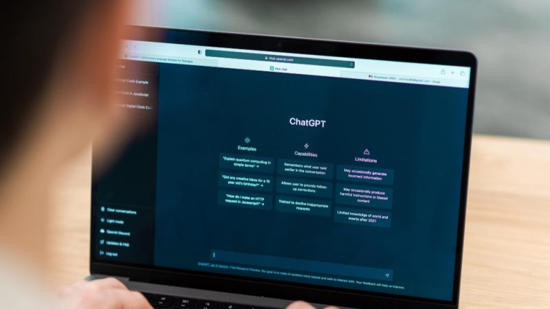
ChatGPT has become one of the most popular AI tools in the world. Millions of users interact with it daily, and one thing many have noticed is its clean, modern, and easy-to-read text. The font plays a major role in this experience. So, what font does ChatGPT use, and why was it chosen? In this article, we’ll explore the exact font used in ChatGPT’s interface, its design qualities, and how you can use similar fonts in your own projects.
Understanding the Importance of Font in Digital Design
Fonts are more than just letters on a screen. They create a visual identity, affect readability, and influence user experience. In digital interfaces like ChatGPT, typography must balance beauty and function. A poor font choice can cause strain, distraction, or confusion. A great font, on the other hand, enhances focus and clarity. OpenAI’s team understands this principle well, and their selection reflects it.
The Official ChatGPT Font Name
The main font used in ChatGPT’s interface is Inter, a popular sans-serif typeface designed by Rasmus Andersson. Inter was developed specifically for computer screens, making it ideal for modern web applications like ChatGPT. Its smooth curves, clear letterforms, and proportional spacing make it easy to read at any size or on any device.
While OpenAI may adjust minor design elements over time, Inter remains the foundation of ChatGPT’s current typography.
Why OpenAI Chose the Inter Font
There are several reasons why OpenAI uses Inter as ChatGPT’s default typeface:
- Readability: Inter is designed for on-screen legibility. Each character is distinct, which minimizes reading errors.
- Neutrality: It doesn’t distract users from the main content — your conversation.
- Modern aesthetics: Inter fits with OpenAI’s clean, futuristic branding.
- Performance: The font loads quickly, an important factor for responsive web apps.
- Accessibility: Its open shapes and balanced proportions make it easy for people with mild visual impairments to read.
Together, these features make Inter an ideal font for a platform like ChatGPT, which prioritizes usability and clarity over stylistic flair.
A Brief History of the Inter Typeface
Inter was created by Rasmus Andersson, a Swedish designer and former engineer at Figma and Dropbox. The project began in 2016 as a personal experiment to design a typeface that looked excellent on digital screens. It quickly gained popularity because of its balance between friendliness and precision. Today, Inter is open source and used by thousands of web developers, designers, and major tech brands.
This open-source nature also aligns with OpenAI’s philosophy of collaboration and transparency, making it a fitting choice.
Font Style and Characteristics of ChatGPT’s Interface
The Inter font features a simple geometric design with subtle humanist touches. Its characteristics include:
- Rounded edges that reduce sharpness and create a welcoming tone.
- Wide apertures that make letters like “a,” “e,” and “s” more distinguishable.
- Uniform line spacing that prevents text from feeling cramped.
- Balanced x-height for better legibility on mobile and desktop screens.
These design choices give ChatGPT’s text a smooth and consistent appearance, helping users read comfortably for long sessions.
Font Sizes and Line Spacing in ChatGPT
Font choice is only part of the visual experience. ChatGPT also uses carefully tuned line spacing and font size ratios to optimize readability.
The body text typically appears around 14 to 16 pixels, with generous line height and padding to prevent clutter. This balance allows large blocks of text — such as explanations or code snippets — to be easily scanned and understood.
The minimalist color scheme, using shades of gray and white, ensures the font remains easy on the eyes, especially in dark mode.
Alternative Fonts Similar to ChatGPT’s Inter Typeface
If you like the look of ChatGPT’s typography and want to use something similar in your own designs, consider these fonts:
- Roboto: Designed by Google, Roboto is one of the most widely used sans-serifs on the web.
- Open Sans: Another clean, readable option ideal for websites and mobile interfaces.
- Lato: Known for its friendly curves and excellent readability.
- Nunito: Slightly more rounded, giving a softer tone while maintaining professionalism.
- Source Sans Pro: Adobe’s open-source alternative with strong screen legibility.
These fonts share similar characteristics with Inter and can be used as alternatives if you want a comparable design feel.
How Font Affects User Experience in AI Interfaces
The font in an AI chat environment directly impacts how users perceive the conversation. A good typeface enhances trust and engagement. If the font were hard to read or looked outdated, users might subconsciously associate that with a lower-quality AI experience.
A readable font like Inter ensures that text-based responses — which are the entire product of ChatGPT — remain accessible and comfortable to read for extended periods. In UX design, this concept is known as typographic empathy: designing with an understanding of how text feels to the user.
How to Use Inter Font in Your Own Design Projects
Because Inter is open source, you can use it for free in your own projects. Here’s how:
- Visit the Inter font website or Google Fonts library.
- Choose the styles you need (Regular, Medium, Bold, etc.).
- Embed the font using a CSS link or download it to your computer.
- Apply it in your website or app using the CSS property font-family: ‘Inter’, sans-serif;.
Designers often pair Inter with other fonts for visual contrast. For example, using Inter for body text and a serif font for headings can create a sophisticated visual hierarchy.
The Psychology Behind ChatGPT’s Font Choice
Typography affects emotion as much as it affects readability. The Inter font gives ChatGPT a sense of calm authority — it’s friendly but not playful, modern but not cold. This balance helps users feel comfortable trusting ChatGPT’s responses.
OpenAI’s entire design system, from the green accent color to the simple interface, supports the goal of reducing friction between humans and AI. The typography plays a crucial part in that experience, ensuring that every word feels intentional and approachable.
Conclusion
The font used in ChatGPT, Inter, perfectly complements OpenAI’s mission to make AI accessible, understandable, and user-friendly. Its clarity, modern design, and adaptability make it ideal for text-heavy environments where readability is everything. By combining aesthetic simplicity with high usability, Inter helps deliver the smooth, conversational experience that ChatGPT users enjoy daily.
If you’re a designer, developer, or simply curious about digital typography, understanding fonts like Inter can help you create better, more human-centered digital experiences.
FAQs
1. What is the official font used in ChatGPT?
ChatGPT uses the Inter typeface, a clean, modern sans-serif font designed for digital readability. It was created by Rasmus Andersson and is widely used in tech applications.
2. Is the ChatGPT font available for public use?
Yes. Inter is open-source and free to use. You can download it from the official Inter website or from Google Fonts for your personal or commercial projects.
3. Why did OpenAI choose Inter for ChatGPT?
OpenAI selected Inter for its balance between legibility, performance, and modern aesthetics. The font’s design minimizes visual fatigue and provides a clear, distraction-free reading experience.
4. Can I use the same font as ChatGPT on my website?
Absolutely. You can easily integrate Inter using a simple CSS import or Google Fonts link. It’s highly compatible with most web browsers and devices.
Does the font change in ChatGPT’s dark mode?
The font itself remains the same in both light and dark modes. However, the color contrast and background shift in dark mode, making the text appear slightly softer to reduce eye strain.
Also read: Tea Report Card – Grading the Best Teas for Flavor, Quality, and Aroma